revolutionary techniques to improve your images By Dr J Floor Anthoni (2003-2006)
www.seafriends.org.nz/phgraph/darkroom.htm
Note! this used to be a very long document, now split into three parts.
The darkroom is back with a vast array of
sophisticated tools and techniques to improve your images. But it is a
long road towards mastering it. With the help of this chapter we hope you
will get there faster. One thing is sure: ignoring it puts your photography
at a disadvantage. It is important that you, the photographer, become a
digital darkroom master because no-one else knows what your photos should
look like. And don't be disappointed if mastering the digital darkroom
may take two or more years because it remains a joy for a lifetime.
The digital darkroom involves a series of conversions. First the real
world is converted to film and the film to electronic image which must
be immediately suitable for printing on photographic paper or by printing
press. So knowledge of the various media is important.
introduction In the era of the great beginning of photography, everyone used negative
film to capture the right moment, but that was only the beginning of a
work of art. The techniques employed in the darkroom would determine the
outcome to such extent that each print was considered another original.
Mastering the right choice of grade (contrastiness) of paper, dodging parts
of the image and so on, were considered part of the art of photography
and the results are there to witness.
Then colour photography came, which was much more demanding on the darkroom,
and machines eventually won the battle. Diapositive (slide) films were
introduced and slide projectors sold like sliced bread. Photographers shifted
their attention from the darkroom to the moment that the photo was taken.
With over and under exposures, fill flash and judicious lighting, and pre-arranged
moments, the editing was done inside the camera. Post production simply
consisted of throwing out what did not make it.
But now the digital era has arrived, even digital cameras with instantaneous
results. Images can now be viewed on computer screens and powerful video
projectors are gradually replacing the slide projector. Soon perhaps all
photographic materials will become obsolete. But for the moment we live
in the transitional period between film and digital camera. It is an era
in which we can have the benefits of all existing systems, benefits which
will make your images look better than ever before, but it is not easy.
So why would you wish to tinker with the image you produced? Isn't it a
form of cheating?
Think again about why you want to take photos. Invariably you want to
capture a magical moment. But why is it that so many photos don't make
it? Why do you need to throw so many away? Isn't that another form of cheating
by showing only what passed the test? Why would you burden your spectator
with unintentional blemishes like:
emulsion scratches: caused by the camera or the processor.
emulsion drop-outs: present in every film, a matter of chance.
dust and hairs: some dust finds its way into the emulsion; hairs
can intrude by accident.
excessive graininess: certain subjects demand fast film; graininess
is always an issue of compromise.
unintended unsharpness: from subject motion, hand holding, wind,
scanning, poor optics.
poorly matched contrast: when does a photo look like the real world?
colour cast and colour mismatch: colours change throughout the day
and also depend on clouds, but our eyes appear to compensate for this,
however the film does not.
reciprocity failure: very long and very short exposures change the
colours.
unintended and distracting objects: the little detail that spoils
the grand photo.
processing stains: your unlucky day in the photo processing lab.
fungus: woolly threads that destroy your image over time.
specks, drops or bubbles on the lens: they can spoil an entire roll.
Just imagine you had a tool that would enable you to remove all of the
above while adding more quality as well? You would need less film. Your
shoots would become less critical and stressful and you would be more economically
secure. Well, this tool has arrived, the digital darkroom,
the perfect tool to make your photos look the way they were meant to be;
the opportunity to respect your own work by giving it some after care;
the opportunity for amateur photographers to make more impact.
In this chapter we will explore the new digital darkroom techniques
which begin with a photographic image or a digital scan. Without realising
it, the digital world introduces new problems. People don't realise that
a digital image cuts the real world into millions of little pixels, each
with its own colour and intensity. So the continuity of shapes is shattered
and this introduces additional problems:
additional graininess and 'noise': electrical signals produce their
own random noise, dependent on colour and amount of light, and the quality
of the digital camera or scanner.
rastering and aliasing (repeating raster patterns): the pixel raster
may interfere with the subject's raster.
curves consisting of steps: pixel discontinuity particularly shows
in slanting lines and curves.
colours consisting of steps: in gradually blending colours, steps
become visible.
loss of colour: colours are bleached in the highlights and are lost
in the shadows.
colour mismatch: a natural colour cast or colours not perceived
correctly by the medium.
contrast mismatch: image looks too bleak or too peppy.
blur: blur from scanning a curved film or from poor scanner optics.
Blur from resampling.
compression (JPEG) damage: the compression algorithm can damage.
intensity banding: failures in the CCD or unevenness of pixels.
colour banding: uneveness in the CCD.
mistakes made in the digital darkroom: it is easy to overdo the
possibilities, resulting in damage.
storage and backup: suddenly your photo cabinet needs to find space
on hard disk and it needs to be secured.
expedition storage: no longer are photos stored on an unlimited
number of films but on flash memory cards.
Are you still interested? Read on and become a digital darkroom master.
It adds fun to your profession or hobby and you will learn so much more
about your photos.
But what are the things you need and how much is all this going to cost?
You need a very good scanner like a Nikon Coolscan 4ED which gives slow
but accurate and low noise scans while also providing auto focusing over
the entire image ($2000 but available second-hand for much less).
You need a good colour printer such as an Epson Stylus Photo 1290 ($1000?).
You need a good photo editing program such as Photoshop or Corel Photo
Paint as part of the CorelDraw suite ($1000?). With some research you may
find
cheaper solutions that may suit your needs.
Note! to avoid confusion,
some of the terms commonly used in the darkroom and more recently in the
digital era, are explained here:
tone refers to contrast
which is also called grade. The word tone is also used to mean luminosity
or the colour density, or its equivalent on a grey scale from black
to white.
hard and soft
are identical to high and low contrast. The words peppy
and dull are also used for this.
colour cast is an unwanted
colour intrusion over all colours. It is particularly visible in the shadows.
properties
of the media In the chapter about lens and film, we compared
the registration media of slide, negative and digital, and this we need
to do in more detail here.
negative film: has an enormous 'reach' or latency of up to 10 f-stops,
which renders it practically insensitive to overexposure. Present-day negative
films have fine grain for their speed and they reproduce colours faithfully.
But it is an intermediate step and the printing stage can introduce unwanted
side effects such as colour and contrast shifts. Negative film is not easily
traded since it is stored in strips, but proof prints can be handled easily
and they are large and convenient. Storing negatives and proof prints is
efficient and compact. Now that the scanned images can be traded, the disadvantages
of negative film have disappeared, leaving only its enormous benefits for
the photographer. Negative film can provide 5-8 f-stops of true colour.
slide film: slide film has been the preferred medium for trading
since it represents the finished product. Designed for projection, slide
film can be used for printing by exerting enormous care. Although the film
has up to 7 f-stops density range, these represent just 5 f-stops of subject
light, since contrast makes up for the other two. You must realise that
slide film consists essentially of two films: a colour negative film with
Red, Green and Blue (RGB) sensitive layers (which produce a CMY image)
and a black and white film which cuts in at 4 f-stops, to make the shadows
velvet black. Note that after reversal, a slide film contains Cyan
Magenta Yellow and Black (CMYK) pigments (see below).
Because at the top of the density scale the colours are truly bleached
(no colour particles) and at the bottom of the scale they are mixed with
black, slide film essentially has only 2-3 f-stops of true colour registration.
This makes working with slides and scanning them very critical.
digital cameras: For video the digital camera has evolved
to perfection with three individual CCDs (Charge-Coupled Devices) for each
of the main colours RGB, for the first time able to register fluorescent
colours by its additive colour property. However, still cameras are still
in the megapixel race with a single CCD. This makes most digital cameras
very inferior to neg or slide film. They are simply unable to capture the
fine colour nuances of nature. However, Nikon among others, shows that
the single CCD has come a long way. Whereas neg and slide films register
light in logarithmic density, the digital camera produces a linear signal.
How this signal is arrived at, is a secret of the camera manufacturer.
But in general it can be said that digital cameras produce soft (not contrasting)
images. Some cameras produce an RGB image with high colour density precision
(12 bits = 4096 steps, vs 8 bits = 256 steps) but such images can only
be stored in the manufacturer's RAW format, such as Nikon's NEF format.
They also use quite a lot more storage space.
prints: photographic prints convert the negative image to a slide
on paper. Like the slide film, they too are contrasting while having
a black silver layer to create that velvet black effect.
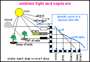
To
rehearse what was discussed in the chapter on film and
lens, the real life situation originates a range of 10 f-stops (1:1000)
of light and it is the skill of the photographer to capture the most important
5 on film. The dotted line would produce true logarithmic registration,
as our eyes would, but such images look very dull. Hence all slide films
become more contrasting from the mid tones to the shades. Not shown is
how this is achieved by a separate black silver layer in the emulsion.
Note that in this diagram the bottom scale runs opposite to that in the
tone curve tool, discussed later. Note also how our eyes (like our other
senses of hearing, taste and smell) register logarithmically, which means
that we perceive a factor (like an f-stop) as a linear step (like a difference).
Thus the intensities of white, bright colour, full colour, dark colour
and shade are perceived as equally distant, whereas in fact they are separated
by factors (f-stops). This creates a problem in the scanned signal.
On the computer a colour picture is represented by three bytes corresponding
to the colours RGB. Each byte consists of 8 bits, together coding for 256
levels of intensity from 0 (black) to 255 (white). Together the three bytes
code for 256x256x256= 16,777,216 different colours, which seems a lot but
isn't. Many of the colours cannot be printed and the 256 intensity levels
for each primary colour are critical.
The
diagram shows an image as pictured by the tone curve tool. The grey shape
is the histogram, consisting of vertical bars for each of 256 densities
from 0 to 255. The height of each bar counts the number of pixels for that
intensity. The whole shape is scaled down to fit the rectangle.
Now look at the way we perceive densities on the vertical axis, and
the way f-stops are represented on the horizontal axis. 256 levels may
seem a lot but they are not. The first f-stop occupies levels 255-128,
totalling 127 discrete steps. The next f-stop 127-64 covering 64 steps,
the next from 63-32 ranging 32 steps and the 4th f-stop has only 16 levels.
It is clear that the dark colours are much less rich in variety than the
light colours.
In the darks the scanner experiences low light levels, adding electrical
noise to the CCD signals. Thus the quantisation noise (colour steps) and
the electrical noise can produce unwanted graininess in the dark colours.
Note that is the other way around in neg film.
Note the red curve which goes through the intersections of the linear
and the logartithmic (f-stop) grids. I have named this the log-lin
curve since it restores a linear signal into a logarithmic one, adapting
the density more to what the eye perceives. This will be discussed further
in the subchapter on scanning in part 2. Note
that digital cameras may have a similar algorithm to render their images
more natural looking. Note also that the loglin
curve exaggerates contrast in the darks while softening the highlights.
How can it be that so many of the images we are seeing in magazines
are not well adapted to the way we see? How is it possible that so many
don't look like the real world we live in? A typical example is the National
Geographic magazine which lets us travel around the world. Yet what we
see is not at all the world we live in, as their pictures are dark and
colourless and often blurred and grainy. Why?
This institution prides itself in its photography. It has a megastore
of images carefully cellared at conditions for long safekeeping. The type
of film known to last for over a century without perceptible loss in colour
is Kodachrome. So all National Geographic photographers are compelled to
use this film which comes in a slow but fine-grained version (25 ASA) and
a faster coarse grained one (160 ASA) with also an intermediate 64 ASA.
It is an excellent film for slide projection but as shown in the film
comparison diagram in the film and lens chapter,
is rather contrasting. To make matters worse, the photographers like to
underexpose this film (to capture true colours by avoiding the bleached
highlights), resulting in rather dark images with colours diluted by black.
The way these images have been scanned, also leaves a lot to be desired.
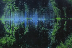
Below we have an example from one of their best underwater photographers.
In this National Geographic image taken under water in a
very clear fresh water spring, the vibrance of colours has disappeared,
replaced by somber dark almost monochrome, a result of underexposure with
Kodachrome film and uncorrected scanning.
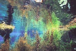
f027608: a similar situation recorded with negative film
and scanned for optimal natural rendition. Notice the transparency and
vibrance of colours, as in the real world.
For more examples see /images/pupu.htm.
resolution The required image size or finenes or resolution is often poorly understood,
by photographers and publishers alike. Often a 30MB file is requested for
an A6 (quarter page) reproduction. Publishers and printers confuse their
equipment's ultimate fineness of 600-1800lpi (lines per inch) with what
the eye can perceive in a raster image in dots per inch (dpi).
When printing sharp text, a high resolution is required to prevent the
steps in slanting lines and curves (alias) but the human eye cannot perceive
this in photographic images. I have printed many brochures with text in
compressed JPEG at 200dpi (1.4MB for an A4 page stored on floppy disk!)
which because anti-aliasing was used (fogging the stepped contours of the
letters) looks sharp and smooth. We must not forget that the sharpest of
lenses do no better than 100 lines per mm on film and that most films can
only just match this. Thus the maximal resolution of a 35mm image is around
36x100= 3600 vertical lines, just visible. It can be exceeded only by having
better optics, using small apertures and the finest of films and co-operative
subjects of course. Alas this is not possible for most real-world situations.
In order to produce 3000 'lines', one must have at least one light pixel
alternated by one dark pixel in a 3000x2000 pixel image. Clearly, 3600
lines is not attainable in a 35mm original.
Art magazines pride themselves in producing sharp images at 300 dpi,
but much of this is negated by uncertainties in paper alignment during
printing. Fortunately a small amount of misalignment produces a false sense
of sharpness. Note that by far most magazines do no better than 200 dpi
and that newspapers are limited to 100 dpi. To standardise our discussion
on sharpness and resolution, I have produced the table below, all relating
to fine art print at 300 dpi. Note that each step corresponds roughly to
a factor 1.5 (in fact the square root of 2 = 1.414). By this measure, A4
quality can be attained only with willing subjects, much light and a good
primary lens (not a zoom lens). Most of my own photographs do not quite
make it and rate A5 instead. However where these are good A5s, I retain
the larger image size. Note that most commercial scanners produce 3000x2000
pixels (Kodak) but an in-house Nikon Coolscan4ED does about 4050x2700 on
a 2870 pixel CCD.
Note that an A5 quality defined this way can quite happily
be enlarged to A4 and even A3, as most photographs in print are not much
better and the image is viewed from further away. Note also that those
produced with large format cameras (45x60mm, 60x60mm) are often preferred
for full page photographs.
Also note that A4@200dpi is identical to A5@300dpi. Note that we've
used dots per inch (dpi) here instead of the more correct pixels per inch
(ppi).
All above values at
art quality 300 dpi; normal magazine print quality is 200 dpi.
Normal scanner resolution
for 35mm is 3000x2000 pix. High res 4200x2800 pix.
* compressed further, visually
acceptable as slide show or for comping.
frame size
mm
inch
image size pix
image size MB
file size
A4 full page
300x210
12x8
3600x2400
26 MB
4-9MB
A5 half page
210x150
8x6
2400x1800
13 MB
1.5-3MB
A6 quarter page
150x100
6x4
1800x1200
6.5MB
0.8-1.5MB
A7 eighth page
100x75
4x3
1200x900
3 MB
0.4-0.8MB
A8 'business card'
75x50
3x2
900x600
1.5MB
0.2-0.4MB
Screen size
-
-
800x600
1.5MB
0.1-0.2MB*
colour
space If an alien were to compare our pictures with the world he saw, he
would have fits of laughter about our naive ways of perception. The colour
of a pixel of a yellow rose does not consist just of a yellow spectral
line but of a whole emission spectrum ranging from infrared to ultraviolet.
What our eyes perceive is but a grotesque caricature of this rich spectrum,
but even so it is an incredible feat of evolution that we have evolved
the sensitivity to three primary colours that together give a fair idea
of the colour of things.
In other words, colour photography is a coarse caricature of the real world,
adapted to the way humans perceive colour in three separate colour receptors
for Red Green and Blue. The nerve signals produced by these receptors are
added together to a single colour for each pixel on our retina.
Amazingly, left and right eyes produce almost identical results which are
correlated in the brain's perception centre. Not surprisingly, RGB are
the main colours in a TV set, a TV camera, slide and print film. But colour
vision is even more amazing considering that the spectra of the cone cells
in our retinas overlap so much.
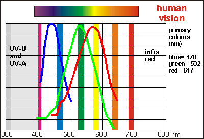
This
diagram shows the lay of the visible colour spectrum bordered by invisible
ultraviolet on the short wavelengths, and infra-red in the long wavelengths
measured in nanometres (nm). The three curves represent the absorption
curves for the three pigments in the cone cells sensitive to blue, green
and red. Note how the red and the green cone cells overlap, red colour
perception being located far away from the actual red we perceive. How
the wiring inside our eyes and the optical cortex works precisely, is not
known but experiments have shown that three primary colours of blue, green
and red located at 470, 532 and 617 nanometres, produce all the colours
we are able to see. These also correspond to the emission spectra of phosphorescence
used in TVs. Note that our eye's red cone cells peak again past the blue,
allowing us to see purple (not shown in the diagram).
Thus
in theory the three components RGB work entirely independent from one another.
Because of this, we can draw a cube (colour space) representing all colours
that can be composed from RGB. The origin of this cube is black
(K), and its axes are R G and B. Thus R G and B make three of the
corners of the cube; black and white two other; the remaining three are
the secondary colours Cyan, Magenta and Yellow. These are the primary colours
in printing, which is done in the CMY colour space represented by the red
triangle. By adding black (K) and printing on white paper (W), this colour
space is essentially the six-sided five-cornered hexahedron CMYKW,
referred to as the CMYK colour space. The colours in the space between
the cube and the smaller hexahedron can thus not be printed, which
includes pure blue, red and green and the fluorescent colours. Note that
the distance from the origin to any colour inside the cube is the Lightness
or Luminosity of that colour.
This
diagram shows the CMYKW hexahedron (two triangular pyramids together)
and the red base triangle. Mixing C, M and Y reaches any colour inside
the triangle but not outside in the same plane and not above or below it.
But they still make the colours of the rainbow, although the primary colours
R G and B are not so bright. The colour palette on the right shows the
colours as if the sides of the hexahedron were folded open. Below
the equator, colours mix with black, becoming darker, as above they mix
with white, becoming lighter. Not shown are the colours of the inside of
the hexahedron, which are the browns, greys, olives and so on.
The space inside the cube contains the gamut of colours
(the whole range) we can see. But the gamut for what can be printed is
much less, inside the hexahedron. Hence the sRGB standard stays
within the gamut of what can be printed, or the range of subtractive
colours. Your photo editing program provides an option to test whether
the colours of your final product lie within the printable gamut (gamut
test). Those colours that don't will be truncated or limited, which should
be avoided.
The
CMY dyes used for printing do not let a small part of the spectrum through
but a wide part, and they overlap in such ways that graduations between
combinations define new colours the way we see them. Unfortunately, this
ideal cannot entirely be achieved, resulting in a different colour rendition
depending on the manufacturer of the dye. The diagram shows the principle
of subtractive colour mixing as it happens on photographic negatives, slides
and in colour printing. The top three rows show the simplified spectral
ranges of each of the C M and Y dyes. Note that each lets two primary
colours through. Mixing Cyan and Yellow blocks red and blue while letting
Green through. Likewise Cyan mixed with Magenta, lets Blue through and
Yellow mixed with Magenta produces Red.
inks and oils The
look of colour images depends on whether the dyes used are transparent
or opaque. Inks are transparent, letting the white of the paper shine through.
Photographic dyes are also transparent and the brilliance of the print
often depends on the reflectance or pearliness of the photographic
paper. Note that the light of ink and photographic prints pass twice through
the colour dyes: once on the way in and again on the way out. In this manner
a thin colour layer produces deep colours. When printing overhead transparencies
on ink jet printers, the difference can clearly be seen. It takes some
practice and experience to get the right amount of ink on such transparencies.
Oils such as used in painting and printing, are not transparent, and neither
are powders used in colour copiers. The artistic oil painter uses white
paint and bright oils to bring light in his paintings. The colour printer
uses the technique of rastering, which applies a precise quantity of paint
while also leaving a precise quantity of white paper unpainted. When applied
very lightly, printing inks have some degree of transparency.
The LCH colour space (Luminosity, Chromaticity, Hue) is shown here.
At its equator one finds the hue or colour wheel or rainbow,
going fully 360 degrees around. In this manner each primary colour is located
opposite its complementary colour. But remember that the visible light
spectrum does not form a closed circle. The vertical axis is Luminosity
or lightness and the radius represents colour density or
chroma.
One finds the grey scale right through its middle from white on top to
black on the bottom. Inside the peel of bright colours, one finds the more
subdued ones, including the browns and olives. Note that the colours in
this drawing are not quite right.
do slides produce additive colours? There
exists confusion about which media produce additive colours, thus the complete
range of colours. Let's examine this further by looking at a colour TV
screen. It is made up of groups of three dots (or similar shapes) for the
colours Red, Green and Blue. Three electron beams inside the tube are aimed
precisely at each dot through a variety of patented systems. In this manner
each colour dot behaves as if it were an independent little light source.
Being too fine for our eyes, we see each group of RGB dots as a single
colour pixel. The colour picture shown here was made by shining three spotlights
in the colours RGB on white paper. Where the spots overlap, the secondary
colours CMY are formed by addition and in the middle white. Look at the
whole pattern from a long distance and you see only a white patch as all
colours merge in the bizarre neural network of our retina.
Modern LCD computer screens likewise have precisely placed RGB dots,
each masked by a Liquid Crystal Display element. The whole is back-lit
by neutral white light. Thus the intensity of each colour in each pixel
can be controlled with precision, much like a standard colour TV. Thus
LCD screens, even though they hold back light, produce additive colours.
In LCD projectors, the white light beam is split into three parts, each
filtered for the primary colours RGB. Each has an LCD matrix which controls
the intensity of each pixel. Then the three light beams are precisely brought
together again and their light merges additively.
A
negative film has three layers sensitive to RGB (a) but during development
the dyes for the complementary colours CMY are coupled to these silver
halides (b). A negative image results. When printing this image on photographic
prints, the same process inverts the image again, resulting in a positive
image.
A
slide film also has three layers sensitive to the primary colours RGB.
This layer is first developed, resulting in a grey scale image (a,b). A
reversal is induced with light or chemical reactions, activating the unexposed
components and coupling CMY dyes to these (c). The resulting combinations
of CMY in these layers produce a positive image once the exposed silver
halides have been removed. Thus a slide film ends up consisting of subtractive
colours CMY.
This
diagram shows how light travels in a photographic print and how it traverses
the dyes twice, which doubles colour contrast and intensity. Blue travels
through Cyan + Magenta; green through Cyan + Yellow and red through Magenta
+ Yellow. Where the three CMY occur, the light is blocked entirely. Likewise,
where no dye is located, all light components bounce back from the pearly
base.
the sRGB colour profile The colour profile most used is sRGB (scanner or subtractive RGB) which
makes the best use of the RGB colour space for prints and photos. It makes
worldwide exchange of colour images possible. Note that sRGB is not the
same as video RGB which is additive RGB and is richer in colours that cannot
be reproduced in print.
For your digital darkroom you first need to set the computer monitor
characteristics to sRGB. In Windows, right-click (menu-click) on the desktop.
Select properties then the settings
tab. Select high colour 16 million colours
or better and the required screen resolution (say 800x600). Click Advanced,
then the Colour management tab and set it
to sRGB colour management. Close all windows.
Do similarly for your printer and scanner (see your printer and scanner
instructions).
Use the grey scale checkerboard test pattern
to calibrate your printer. This image has been saved in paletted GIF (Graphic
Internet File) format. Open it in your photo editor and convert it to RGB
(not really necessary). Print it on your printer as if it were a colour
image to see where a colour cast comes in. If possible, disable the black
ink. But if you want to use it as a colour test image for your camera,
print it in greyscale by disabling the colour inks. Disable
the print profile of the editing software and use the printer's sRGB profile
instead. Study the result for colour cast in the black and white
and adjust the individual colour settings for CMY until the checkerboard
looks like a black and white photo. Save the obtained printer profile for
later use. Adjust your screen colours if a colour cast is visible.
In your photo editing software, open a good colourful photo and print
it. Disable the print profile of the editing software
but use the printer's sRGB profile instead. Adjust your screen contrast
and intensity to make it look like the printed photo. Take your file to
a commercial printer to print a Xerox colour copy or/and a digital photographic
print. Compare all results. They should be uncannily equal, such is the
rigour of the sRGB standard. Only by doing this will you be sure that your
work will reproduce elsewhere as intended. Don't be disappointed if this
takes a week to achieve.
other colour spaces In the course of the history of colour technology, a number of colour
schemes have been used and are still in use today. Here is a quick overview
of some commonly used profiles:
LCH: Luminosity (Lightness) + Chromaticity (intensity) + Hue (colour
type). Hue is represented as the colours of the rainbow, chromaticity the
amount of colour and lightness the total lightness of the colour.
Lab: Luminosity + component a + component b. Is almost identical
to LCH.
YCC: is almost identical to LCH. It is a colour scheme used in Kodak
Photo CDs and results in a more compact representation of the picture.
JPEG: is a compressed filing scheme that compresses RGB files by
converting to a YCC colour profile and then compacting it further. There
are two versions: YCC=4,2,2 which is the most compact and common, and YCC=4,4,4
which is more suitable for your originals and archive. What this means
is that the algorithm gives more or less space to colour precision. Note
that the 4,4,4 colour scheme can often not be displayed by DVD players.
TIFF: a comprehensive CMYK filing scheme (not a colour space!) which
can have 12 bit rather than 8 bit colour depth. Used on MacIntosh computers.
Many publishers and editors ask for digital files in TIFF format, not being
familiar with its disadvantages:
TIFF files do not compact very well; they do not have a JPEG scheme. With
4 bytes per pixel these files stay rather large and are unsuitable for
sending by Internet.
CMYK is not a rigorously defined colour scheme like sRGB, and depends largely
on the types of ink used for printing. So each printer has a different
CMYK colour profile.
Conversion from sRGB to the CMYK of choice is accurate and painless and
can be done by the printer.
 To
rehearse what was discussed in the chapter on film and
lens, the real life situation originates a range of 10 f-stops (1:1000)
of light and it is the skill of the photographer to capture the most important
5 on film. The dotted line would produce true logarithmic registration,
as our eyes would, but such images look very dull. Hence all slide films
become more contrasting from the mid tones to the shades. Not shown is
how this is achieved by a separate black silver layer in the emulsion.
Note that in this diagram the bottom scale runs opposite to that in the
tone curve tool, discussed later. Note also how our eyes (like our other
senses of hearing, taste and smell) register logarithmically, which means
that we perceive a factor (like an f-stop) as a linear step (like a difference).
Thus the intensities of white, bright colour, full colour, dark colour
and shade are perceived as equally distant, whereas in fact they are separated
by factors (f-stops). This creates a problem in the scanned signal.
To
rehearse what was discussed in the chapter on film and
lens, the real life situation originates a range of 10 f-stops (1:1000)
of light and it is the skill of the photographer to capture the most important
5 on film. The dotted line would produce true logarithmic registration,
as our eyes would, but such images look very dull. Hence all slide films
become more contrasting from the mid tones to the shades. Not shown is
how this is achieved by a separate black silver layer in the emulsion.
Note that in this diagram the bottom scale runs opposite to that in the
tone curve tool, discussed later. Note also how our eyes (like our other
senses of hearing, taste and smell) register logarithmically, which means
that we perceive a factor (like an f-stop) as a linear step (like a difference).
Thus the intensities of white, bright colour, full colour, dark colour
and shade are perceived as equally distant, whereas in fact they are separated
by factors (f-stops). This creates a problem in the scanned signal.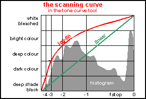 The
diagram shows an image as pictured by the tone curve tool. The grey shape
is the histogram, consisting of vertical bars for each of 256 densities
from 0 to 255. The height of each bar counts the number of pixels for that
intensity. The whole shape is scaled down to fit the rectangle.
The
diagram shows an image as pictured by the tone curve tool. The grey shape
is the histogram, consisting of vertical bars for each of 256 densities
from 0 to 255. The height of each bar counts the number of pixels for that
intensity. The whole shape is scaled down to fit the rectangle.
 This
diagram shows the lay of the visible colour spectrum bordered by invisible
ultraviolet on the short wavelengths, and infra-red in the long wavelengths
measured in nanometres (nm). The three curves represent the absorption
curves for the three pigments in the cone cells sensitive to blue, green
and red. Note how the red and the green cone cells overlap, red colour
perception being located far away from the actual red we perceive. How
the wiring inside our eyes and the optical cortex works precisely, is not
known but experiments have shown that three primary colours of blue, green
and red located at 470, 532 and 617 nanometres, produce all the colours
we are able to see. These also correspond to the emission spectra of phosphorescence
used in TVs. Note that our eye's red cone cells peak again past the blue,
allowing us to see purple (not shown in the diagram).
This
diagram shows the lay of the visible colour spectrum bordered by invisible
ultraviolet on the short wavelengths, and infra-red in the long wavelengths
measured in nanometres (nm). The three curves represent the absorption
curves for the three pigments in the cone cells sensitive to blue, green
and red. Note how the red and the green cone cells overlap, red colour
perception being located far away from the actual red we perceive. How
the wiring inside our eyes and the optical cortex works precisely, is not
known but experiments have shown that three primary colours of blue, green
and red located at 470, 532 and 617 nanometres, produce all the colours
we are able to see. These also correspond to the emission spectra of phosphorescence
used in TVs. Note that our eye's red cone cells peak again past the blue,
allowing us to see purple (not shown in the diagram).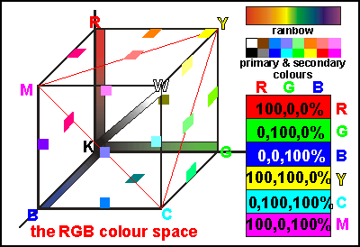 Thus
in theory the three components RGB work entirely independent from one another.
Because of this, we can draw a cube (colour space) representing all colours
that can be composed from RGB. The origin of this cube is black
(K), and its axes are R G and B. Thus R G and B make three of the
corners of the cube; black and white two other; the remaining three are
the secondary colours Cyan, Magenta and Yellow. These are the primary colours
in printing, which is done in the CMY colour space represented by the red
triangle. By adding black (K) and printing on white paper (W), this colour
space is essentially the six-sided five-cornered hexahedron CMYKW,
referred to as the CMYK colour space. The colours in the space between
the cube and the smaller hexahedron can thus not be printed, which
includes pure blue, red and green and the fluorescent colours. Note that
the distance from the origin to any colour inside the cube is the Lightness
or Luminosity of that colour.
Thus
in theory the three components RGB work entirely independent from one another.
Because of this, we can draw a cube (colour space) representing all colours
that can be composed from RGB. The origin of this cube is black
(K), and its axes are R G and B. Thus R G and B make three of the
corners of the cube; black and white two other; the remaining three are
the secondary colours Cyan, Magenta and Yellow. These are the primary colours
in printing, which is done in the CMY colour space represented by the red
triangle. By adding black (K) and printing on white paper (W), this colour
space is essentially the six-sided five-cornered hexahedron CMYKW,
referred to as the CMYK colour space. The colours in the space between
the cube and the smaller hexahedron can thus not be printed, which
includes pure blue, red and green and the fluorescent colours. Note that
the distance from the origin to any colour inside the cube is the Lightness
or Luminosity of that colour.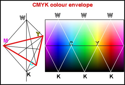 This
diagram shows the CMYKW hexahedron (two triangular pyramids together)
and the red base triangle. Mixing C, M and Y reaches any colour inside
the triangle but not outside in the same plane and not above or below it.
But they still make the colours of the rainbow, although the primary colours
R G and B are not so bright. The colour palette on the right shows the
colours as if the sides of the hexahedron were folded open. Below
the equator, colours mix with black, becoming darker, as above they mix
with white, becoming lighter. Not shown are the colours of the inside of
the hexahedron, which are the browns, greys, olives and so on.
This
diagram shows the CMYKW hexahedron (two triangular pyramids together)
and the red base triangle. Mixing C, M and Y reaches any colour inside
the triangle but not outside in the same plane and not above or below it.
But they still make the colours of the rainbow, although the primary colours
R G and B are not so bright. The colour palette on the right shows the
colours as if the sides of the hexahedron were folded open. Below
the equator, colours mix with black, becoming darker, as above they mix
with white, becoming lighter. Not shown are the colours of the inside of
the hexahedron, which are the browns, greys, olives and so on.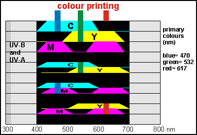 The
CMY dyes used for printing do not let a small part of the spectrum through
but a wide part, and they overlap in such ways that graduations between
combinations define new colours the way we see them. Unfortunately, this
ideal cannot entirely be achieved, resulting in a different colour rendition
depending on the manufacturer of the dye. The diagram shows the principle
of subtractive colour mixing as it happens on photographic negatives, slides
and in colour printing. The top three rows show the simplified spectral
ranges of each of the C M and Y dyes. Note that each lets two primary
colours through. Mixing Cyan and Yellow blocks red and blue while letting
Green through. Likewise Cyan mixed with Magenta, lets Blue through and
Yellow mixed with Magenta produces Red.
The
CMY dyes used for printing do not let a small part of the spectrum through
but a wide part, and they overlap in such ways that graduations between
combinations define new colours the way we see them. Unfortunately, this
ideal cannot entirely be achieved, resulting in a different colour rendition
depending on the manufacturer of the dye. The diagram shows the principle
of subtractive colour mixing as it happens on photographic negatives, slides
and in colour printing. The top three rows show the simplified spectral
ranges of each of the C M and Y dyes. Note that each lets two primary
colours through. Mixing Cyan and Yellow blocks red and blue while letting
Green through. Likewise Cyan mixed with Magenta, lets Blue through and
Yellow mixed with Magenta produces Red.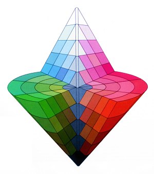 The
look of colour images depends on whether the dyes used are transparent
or opaque. Inks are transparent, letting the white of the paper shine through.
Photographic dyes are also transparent and the brilliance of the print
often depends on the reflectance or pearliness of the photographic
paper. Note that the light of ink and photographic prints pass twice through
the colour dyes: once on the way in and again on the way out. In this manner
a thin colour layer produces deep colours. When printing overhead transparencies
on ink jet printers, the difference can clearly be seen. It takes some
practice and experience to get the right amount of ink on such transparencies.
Oils such as used in painting and printing, are not transparent, and neither
are powders used in colour copiers. The artistic oil painter uses white
paint and bright oils to bring light in his paintings. The colour printer
uses the technique of rastering, which applies a precise quantity of paint
while also leaving a precise quantity of white paper unpainted. When applied
very lightly, printing inks have some degree of transparency.
The
look of colour images depends on whether the dyes used are transparent
or opaque. Inks are transparent, letting the white of the paper shine through.
Photographic dyes are also transparent and the brilliance of the print
often depends on the reflectance or pearliness of the photographic
paper. Note that the light of ink and photographic prints pass twice through
the colour dyes: once on the way in and again on the way out. In this manner
a thin colour layer produces deep colours. When printing overhead transparencies
on ink jet printers, the difference can clearly be seen. It takes some
practice and experience to get the right amount of ink on such transparencies.
Oils such as used in painting and printing, are not transparent, and neither
are powders used in colour copiers. The artistic oil painter uses white
paint and bright oils to bring light in his paintings. The colour printer
uses the technique of rastering, which applies a precise quantity of paint
while also leaving a precise quantity of white paper unpainted. When applied
very lightly, printing inks have some degree of transparency.
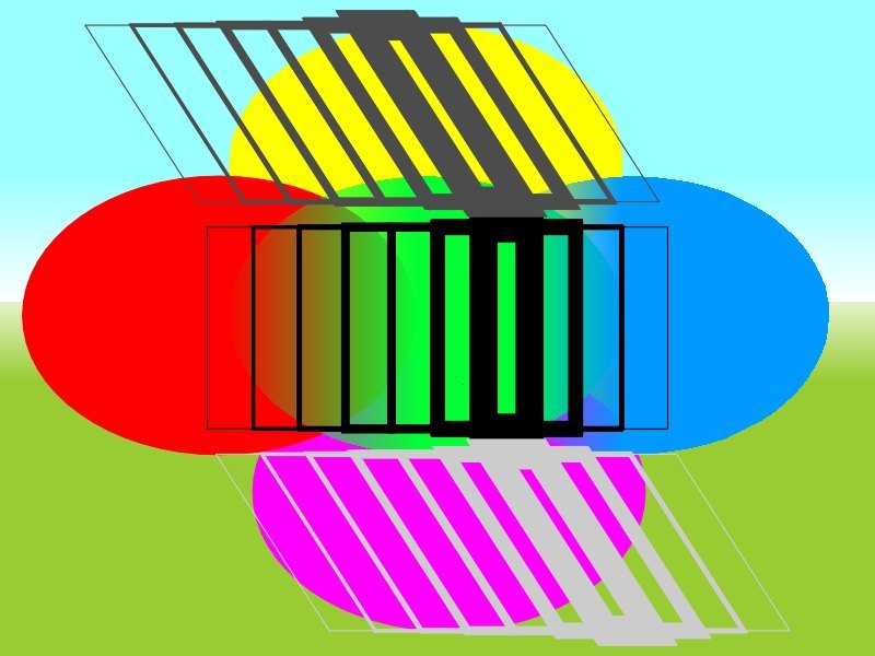
 There
exists confusion about which media produce additive colours, thus the complete
range of colours. Let's examine this further by looking at a colour TV
screen. It is made up of groups of three dots (or similar shapes) for the
colours Red, Green and Blue. Three electron beams inside the tube are aimed
precisely at each dot through a variety of patented systems. In this manner
each colour dot behaves as if it were an independent little light source.
Being too fine for our eyes, we see each group of RGB dots as a single
colour pixel. The colour picture shown here was made by shining three spotlights
in the colours RGB on white paper. Where the spots overlap, the secondary
colours CMY are formed by addition and in the middle white. Look at the
whole pattern from a long distance and you see only a white patch as all
colours merge in the bizarre neural network of our retina.
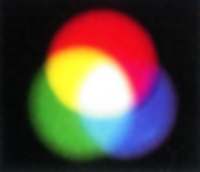
There
exists confusion about which media produce additive colours, thus the complete
range of colours. Let's examine this further by looking at a colour TV
screen. It is made up of groups of three dots (or similar shapes) for the
colours Red, Green and Blue. Three electron beams inside the tube are aimed
precisely at each dot through a variety of patented systems. In this manner
each colour dot behaves as if it were an independent little light source.
Being too fine for our eyes, we see each group of RGB dots as a single
colour pixel. The colour picture shown here was made by shining three spotlights
in the colours RGB on white paper. Where the spots overlap, the secondary
colours CMY are formed by addition and in the middle white. Look at the
whole pattern from a long distance and you see only a white patch as all
colours merge in the bizarre neural network of our retina.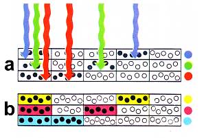 A
negative film has three layers sensitive to RGB (a) but during development
the dyes for the complementary colours CMY are coupled to these silver
halides (b). A negative image results. When printing this image on photographic
prints, the same process inverts the image again, resulting in a positive
image.
A
negative film has three layers sensitive to RGB (a) but during development
the dyes for the complementary colours CMY are coupled to these silver
halides (b). A negative image results. When printing this image on photographic
prints, the same process inverts the image again, resulting in a positive
image.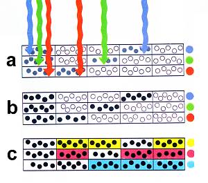 A
slide film also has three layers sensitive to the primary colours RGB.
This layer is first developed, resulting in a grey scale image (a,b). A
reversal is induced with light or chemical reactions, activating the unexposed
components and coupling CMY dyes to these (c). The resulting combinations
of CMY in these layers produce a positive image once the exposed silver
halides have been removed. Thus a slide film ends up consisting of subtractive
colours CMY.
A
slide film also has three layers sensitive to the primary colours RGB.
This layer is first developed, resulting in a grey scale image (a,b). A
reversal is induced with light or chemical reactions, activating the unexposed
components and coupling CMY dyes to these (c). The resulting combinations
of CMY in these layers produce a positive image once the exposed silver
halides have been removed. Thus a slide film ends up consisting of subtractive
colours CMY.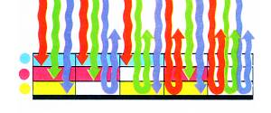 This
diagram shows how light travels in a photographic print and how it traverses
the dyes twice, which doubles colour contrast and intensity. Blue travels
through Cyan + Magenta; green through Cyan + Yellow and red through Magenta
+ Yellow. Where the three CMY occur, the light is blocked entirely. Likewise,
where no dye is located, all light components bounce back from the pearly
base.
This
diagram shows how light travels in a photographic print and how it traverses
the dyes twice, which doubles colour contrast and intensity. Blue travels
through Cyan + Magenta; green through Cyan + Yellow and red through Magenta
+ Yellow. Where the three CMY occur, the light is blocked entirely. Likewise,
where no dye is located, all light components bounce back from the pearly
base.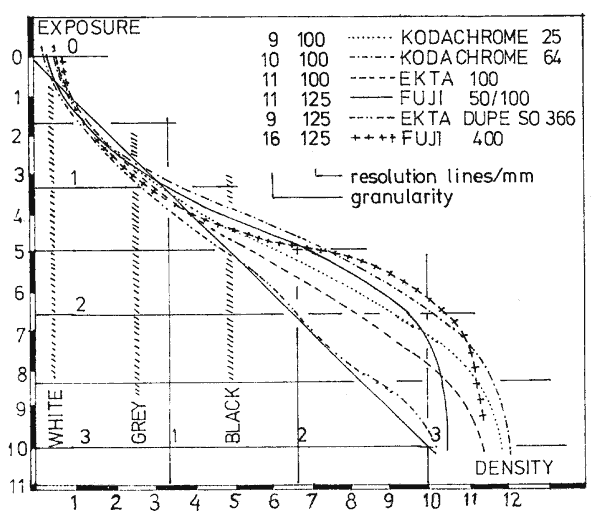